

Dashboard and metrics
The dashboard centralizes all your performance metrics and charts.
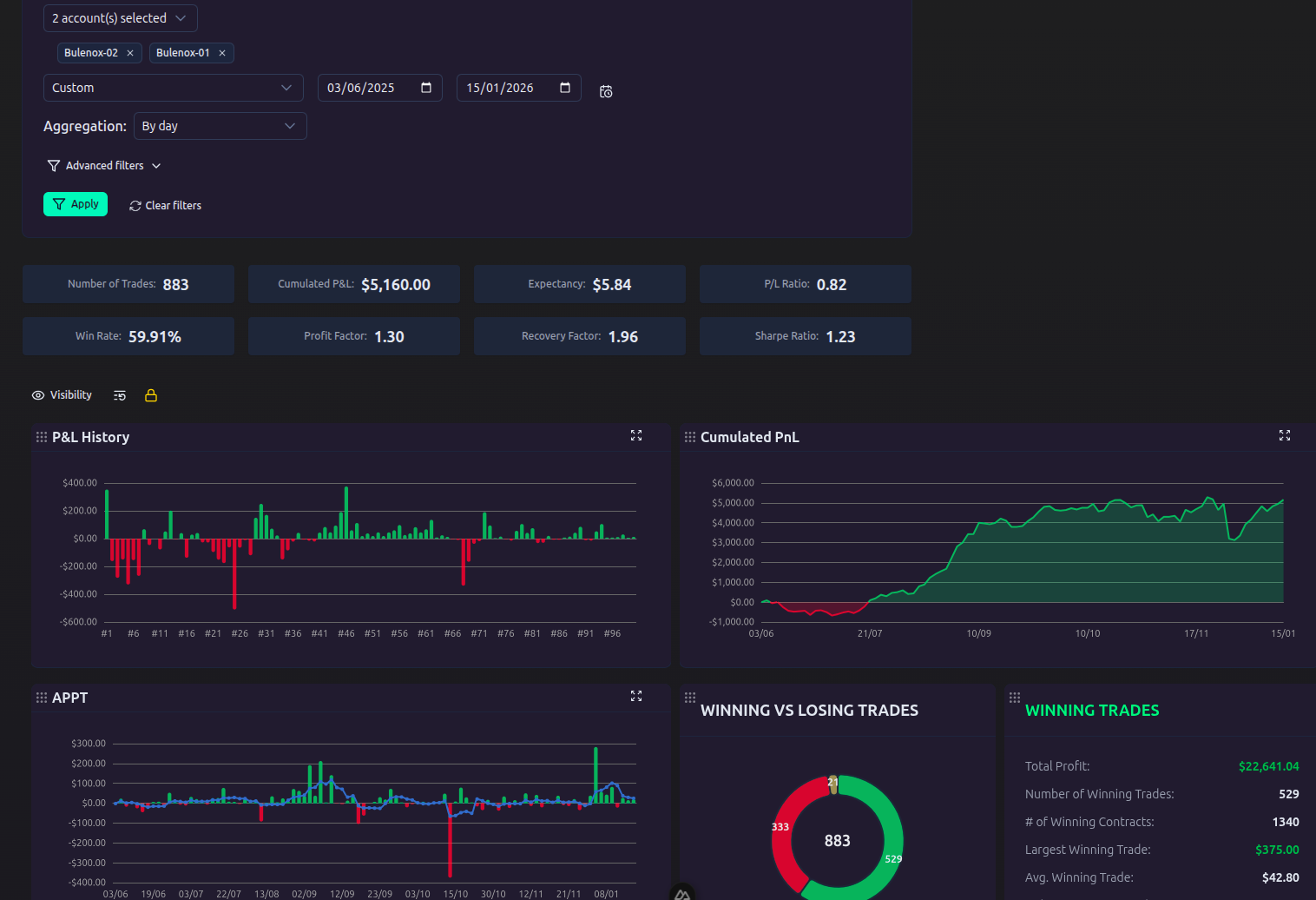
Dashboard filters
At the top of the page, refine your analysis with available filters:
- Period: large choice of preset periods (this week, last week, this month, last month, this year, etc.) or a custom date range
- Accounts: one or more trading accounts
Advanced filters
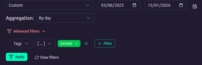
In addition to basic filters, you can apply advanced filters. If you add multiple filter rows, they are combined with AND logic (all criteria must be met):
| Filter | Type | Description |
|---|---|---|
| Symbol | Text / List | Filter by one or more symbols |
| Type | Select | buy or sell |
| Open date / Close date | Date | Date range |
| Lot | Number | Position size |
| Open price | Number | Entry price |
| Close price | Number | Exit price |
| Profit | Number | P&L min/max |
| Tags | List | One or more tags |
Workspaces
The dashboard supports multiple workspaces (tabs). You can create up to 5 custom workspaces in addition to the default Summary workspace. Each workspace has its own layout, visibility settings, and chart instances.
You can rename or delete custom workspaces. Layout changes are saved per workspace.
Layout and visibility
Drag and drop
Unlock the layout to drag and resize charts and sections. Once you are happy with the layout, lock it again to save the positions.
Charts menu
Open the Charts modal to show, hide, or create charts. The modal contains:
- Statistics sections: show/hide the detailed statistics sections (All trades, Winning trades, Losing trades, Winners vs Losers, Risk ratios, Time statistics)
- Add chart: create a new chart from a pre-configured template, organized in 4 categories (Bars, Scatter & Heatmap, Distribution & Profiles, Time series)
- Custom: create a chart from scratch, organized in 3 categories (Breakdown, Time series, Trades)
- Sync to all breakpoints: apply visibility changes to all breakpoints (large, medium, small)
Visibility is configured per workspace and per breakpoint (large, medium, small).
Reset layout
The Reset layout button restores the default grid layout for the current workspace.
Sync across databases
The Sync dashboard button copies the current dashboard configuration (workspaces, filters, layout, visibility, and chart settings) to all other databases. The Sync workspace button copies the active workspace only.
Key metrics
The top cards display the main performance indicators for the selected period and filters. Hover over each card to see its formula.
| Metric | Description |
|---|---|
| Trades count | Total number of trades in the filtered selection |
| Cumulated P&L | Net capital evolution over the selected period |
| Expectancy | Average expected gain per trade (APPT) |
| P/L Ratio | Average win divided by average loss |
| Win Rate | Percentage of winning trades |
| Profit Factor | Ratio of gross profits to gross losses |
| Recovery Factor | Ability to recover from drawdowns |
| Sharpe Ratio | Risk-adjusted return |
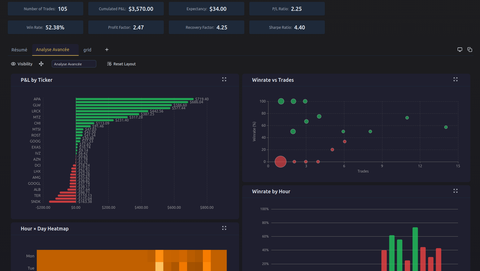
Chart system
The dashboard uses a dynamic widget system. You can create multiple instances of each chart type, each with its own configuration (dimension, metric, display mode).
Creating a chart
Open the Charts modal, then in the Add chart section choose a pre-configured template. The chart is added to the active workspace.
Templates are organized in 4 categories:
Bars
| Template | Description |
|---|---|
| P&L by day of week | Vertical bars, P&L per day (open date) |
| Winrate by hour | Vertical bars, win rate per hour |
| P&L by month | Horizontal bars, P&L per month |
| P&L by month/year | Horizontal bars, P&L per month and year |
Scatter & Heatmap
| Template | Description |
|---|---|
| Hour × Day heatmap | 2D heatmap, P&L per hour and day of week |
Distribution & Profiles
| Template | Description |
|---|---|
| P&L Calendar | Calendar heatmap, daily P&L |
| Winrate vs Profit Factor | Scatter 2D, correlation between winrate and profit factor |
| Avg Win vs Avg Loss | Scatter 2D, correlation between average win and average loss |
| P&L vs Drawdown | Scatter 2D, correlation between P&L and drawdown |
| Duration vs P&L | Scatter trades, individual trade duration vs P&L |
Time series
| Template | Description |
|---|---|
| P&L per trade | Bars, P&L of each individual trade |
| APPT | Bars + moving average, expectancy per period |
| Winrate | Bars + moving average, win rate per period |
Custom charts
The Custom section in the Charts modal lets you create a chart from scratch, organized in 3 categories:
Breakdown
| Template | Description |
|---|---|
| Horizontal Bar | One bar per dimension, sorted by metric value |
| Vertical Bar | Vertical bars, sorted chronologically or by metric |
| Scatter | Points with color = metric |
| Table | Detailed table with selectable columns |
Time series
| Template | Description |
|---|---|
| Bar + MA | Bars + moving average, aggregated by period |
| Area Chart | Cumulative evolution over time |
Series / Trades
| Template | Description |
|---|---|
| Duration vs P&L | Scatter of individual trades, configurable X/Y axes |
The time series widget supports 3 display modes.
Bar mode (per trade)
Displays the P&L (or other metric) of each individual trade as green/red bars.
- Max trades: maximum number of trades displayed (20, 50, 100, 200)
- Binary red/green colors for monetary metrics
BarMA mode (bars + moving average)
Displays metrics aggregated by period (day, week, month) with an optional moving average. A metric selector in the widget header lets you switch metrics.
- Aggregation: day, week, or month
- Show bars: toggle to hide/show bars
- Show moving average: toggle for the MA line
- Tooltip metrics: check additional metrics to display on hover
Area mode (cumulative)
Displays cumulative evolution over time. Only P&L is cumulative; other metrics show the raw per-period value. A metric selector in the widget header lets you switch metrics.
- Aggregation: day, week, or month
- Show threshold: horizontal line at initial capital level (P&L only)
- Tooltip metrics: check additional metrics to display on hover
Horizontal scroll
A Scroll X toggle in the widget header enables horizontal scrolling via a dataZoom slider, useful for charts with many data points. The scatter 2D and scatter trades widgets also support Scroll Y for vertical scrolling.
Available metrics
All modes support the following 11 metrics:
| Metric | Type | Description |
|---|---|---|
| P&L | Monetary | Profit & Loss |
| APPT | Monetary | Average profit per trade |
| Winrate | Percentage | Win rate |
| Profit Factor | Ratio | Gross profits / gross losses |
| Avg win | Monetary | Average winning trade |
| Avg loss | Monetary | Average losing trade |
| Expectancy | Monetary | Weighted average gain |
| Avg duration | Raw | Average trade duration |
| Drawdown | Monetary | Maximum drawdown |
| Current drawdown | Monetary | Drawdown from last peak |
| Trades count | Raw | Number of trades per period |
Crosshair
A single button at the top of the widget toggles between two crosshair modes:
- Cross: vertical + horizontal lines following the mouse
- Line: vertical or horizontal line
Breakdown widget
The breakdown widget analyzes your trades along a dimension (ticker, day, hour, etc.) and a metric. It supports 8 visualization types.
Chart types
| Type | Description |
|---|---|
| Horizontal bars | One bar per dimension, sorted by metric value |
| Vertical bars | Vertical bars, sorted chronologically (days, months, hours) or by metric value (ticker, side, tags) |
| Scatter plot | Points with color = metric |
| Scatter 2D | Correlation between two metrics, with a third metric as point color |
| Scatter trades | Individual trades plotted on two configurable axes (duration, P&L, MFE, MAE) |
| Table | Detailed table with selectable columns |
| Heatmap | 2D heatmap with two dimensions (X and Y) |
| Calendar | Calendar heatmap, daily aggregation with metric selection |
Available dimensions
| Dimension | Description |
|---|---|
| Ticker | Per symbol |
| Side | Buy vs Sell |
| Month (open) | Per month, open date |
| Month (close) | Per month, close date |
| Month/year (open) | Per month and year, open date |
| Month/year (close) | Per month and year, close date |
| Day of week (open) | Monday, Tuesday, etc. (open date) |
| Day of week (close) | Monday, Tuesday, etc. (close date) |
| Start hour | By open hour |
| End hour | By close hour |
| Tag groups | One dimension per tag group (dynamic) |
Filters
- Top N: limit to the top N values (all, 5, 10, 15, 20) — available for bars and scatter
Table
Table mode displays all metrics in columns. Use the column selector to choose which metrics to display. Default columns: P&L, trades count, winrate, profit factor, avg win, avg loss, expectancy, drawdown, current drawdown, avg duration.
Heatmap
The heatmap uses two dimensions (X and Y axes), both selectable from the dimension list. Each cell's color corresponds to the metric value, with a configurable gradient (see Options).
Scatter 2D
The scatter 2D chart shows the correlation between two metrics. Each point represents a dimension value (e.g. a ticker), positioned by its X and Y metric values, with a third metric determining the point color via a visual map.
- X axis metric: metric for the horizontal axis
- Y axis metric: metric for the vertical axis
- Color metric: metric used for the point color gradient
- Log scale: toggle logarithmic scale on both axes
- Scroll X / Scroll Y: toggle scrollbars for large datasets
- Show labels: toggle dimension labels above points
- Top N: limit to the top N values
Scatter trades
The scatter trades chart plots individual trades on two configurable axes. Unlike other breakdown charts, each point is a single trade, not an aggregated dimension.
- X axis property: trade property (duration, P&L, MFE, MAE)
- Y axis property: trade property (duration, P&L, MFE, MAE)
- Ticker filter: restrict to a specific symbol
- Log scale: toggle logarithmic scale
- Scroll X / Scroll Y: toggle scrollbars
Calendar
The calendar chart displays daily aggregation as a heatmap on a calendar layout. Each cell represents a day, colored by the selected metric value.
- Metric: selectable metric (P&L, winrate, trades count, etc.)
- Year selector: filter by year when multiple years are available
- Color palette: divergent (red/green) for monetary metrics, gradient for percentage/ratio metrics
Tooltip metrics
As with time series, you can display additional metrics in the tooltip of bar, scatter, and heatmap charts.
Detailed sections
Several sections provide a detailed breakdown:
All trades
Gross P&L, number of trades, total contracts, average and longest trade duration, win rate, expectancy, total commission, and net P&L.
Winning trades
Total profit, number of winning trades/contracts, largest win, average win, standard deviation, commission, average and longest win duration, maximum winning streak, and max run-up.
Losing trades
Total loss, number of losing trades/contracts, largest loss, average loss, standard deviation, commission, average and longest loss duration, maximum losing streak, max drawdown, and drawdown date range.
Winners vs Losers
Pie chart distribution (winners / breakeven / losers) with percentages.
Risk ratios
| Ratio | Description |
|---|---|
| Profit Factor | Gross profits / gross losses |
| P/L Ratio | Average win / average loss |
| Recovery Factor | Net P&L / max drawdown |
| Sharpe Ratio | Volatility-adjusted return |
| Sortino Ratio | Sharpe penalizing only downside volatility |
| Calmar Ratio | Annual return / max drawdown |
| SQN | System Quality Number (Van Tharp) — requires R-multiples |
| Ulcer Index | Measure of drawdown depth and duration |
Time statistics (hidden by default)
Organized in a 2-column grid layout with the following metrics:
- Total trading days, breakeven days
- Winning days, losing days
- Max consecutive winning days, max consecutive losing days
- Winning weeks %, winning months %
- Average winning day P&L, average losing day P&L
- Largest profitable day P&L, largest losing day P&L
- Largest profitable day date, largest losing day date
- Daily max drawdown, daily max drawdown %
- Average drawdown, average drawdown %
- Average daily P&L
R-multiples
The R-multiple is a risk-normalized metric that expresses your results in multiples of the initial risk (R), regardless of the amount wagered. A +2R trade means you won twice your risk.
Calculation
The R-multiple is calculated automatically from the stop loss:
- Long: R = (close price - open price) / (open price - stop loss)
- Short: R = (open price - close price) / (stop loss - open price)
Without stop loss
When a trade has no stop loss, the R-multiple is estimated:
- Losing trade without SL: R = -1 (assumption: SL hit)
- Winning trade without SL: R = profit / average loss (estimate)
- Breakeven: R = 0
Reliability
A reliability indicator is displayed next to R-metrics, based on the percentage of trades with a valid stop loss:
| Coverage | Reliability |
|---|---|
| ≥ 80% | Reliable |
| 50-79% | Partial |
| 1-49% | Approximate |
| 0% | Hidden |
R-metrics displayed
The following metrics are displayed as R-multiples in the detailed sections (only if at least one trade has a computable R):
- Total R: sum of R-multiples
- APPT in R: average R-multiple per trade
- Total profit in R (winning trades)
- Total loss in R (losing trades)
- Average win/loss in R
- Largest win/loss in R
- SQN (Van Tharp) in risk ratios
Configuration
- Stop loss: entered in the trade form (
stopLossfield) - Planned risk: alternative to stop loss, stored in trade or account metadata (can be imported via CSV)
- Default planned risk: set at the account level (overrides the trade value)
Net / Gross mode
Toggle between net P&L (after commissions) and gross (before commissions) via the toggle at the top of the page.
Plugin slots
The dashboard exposes plugin slots for third-party extensions.